Off topic: Can You Spot the Difference? Penyiaran jaluran : Mr. Satan (X)
|
|---|
Mr. Satan (X)
Bahasa Inggeris hingga Bahasa Indonesia
|
Tom in London
United Kingdom
Local time: 18:22
Ahli (2008)
Bahasa Itali hingga Bahasa Inggeris
Mr. Satan wrote:

No, but can you see anything wrong with this?

| | | |
Stepan Konev 
Persekutuan Rusia
Local time: 20:22
Bahasa Inggeris hingga Bahasa Rusia
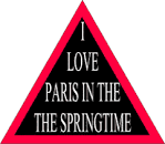
All letters except the capital T are slightly stretched vertacally.
Capital T is different.

[Edited at 2023-03-12 17:37 GMT]
| | | |
Tom in London
United Kingdom
Local time: 18:22
Ahli (2008)
Bahasa Itali hingga Bahasa Inggeris
Stepan Konev wrote:
All letters except the capital T are slightly stretched vertacally.
[Edited at 2023-03-12 17:32 GMT]
I noticed that but I thought it was just a mistake.
| | |
|
|
|
Mr. Satan (X)
Bahasa Inggeris hingga Bahasa Indonesia
TOPIC STARTER
So it is noticeable.
The top sentence was written in Arial font, the bottom one was in Liberation Sans. Both were set to 12 pt. The differences are more pronounced as you increase the size. Below is another example featuring both fonts, with the size blown up to 24 pt.

Other than the shorter capital “T” and the slightly taller fonts in general, you ma... See more So it is noticeable.
The top sentence was written in Arial font, the bottom one was in Liberation Sans. Both were set to 12 pt. The differences are more pronounced as you increase the size. Below is another example featuring both fonts, with the size blown up to 24 pt.

Other than the shorter capital “T” and the slightly taller fonts in general, you may spot that the lowercase “a” from Liberation Sans has a longer and curvier tail. Arial’s lowercase “t” also has a sharper head. Perhaps the most striking lack of resemblance is the number “1”. They look nowhere near the same. Some of the symbols are also prominently distinguishable.
Liberation Font family was poised to be the metrically-identical replacement (ooh, fancy words) for the commonly used Microsoft fonts, e.g. Arial and Times New Roman. I was curious to see how much would people be able to tell them apart. Of course, the designs couldn’t be entirely similar. That would be plagiarism. But the effort itself is commendable.
Tom in London wrote:
No, but can you see anything wrong with this?

Paris. Because their numeral system is out of whack.
A: Hello, how do you say 99 in French?
B: Oh, it’s four multiplied by twenty plus nineteen.
A: 
[Edited at 2023-03-13 09:02 GMT] ▲ Collapse
| | | |
Jo Macdonald 
Sepanyol
Local time: 19:22
Ahli (2005)
Bahasa Itali hingga Bahasa Inggeris
+ ...
|
| |
Cilian O'Tuama 
Jerman
Local time: 19:22
Bahasa Jerman hingga Bahasa Inggeris
+ ...
|
|
|
Mr. Satan (X)
Bahasa Inggeris hingga Bahasa Indonesia
TOPIC STARTER
Ice Scream wrote:
No. Why?
I like this Liberation Sans font. I think I'll marry it.
| | | |
Tom in London
United Kingdom
Local time: 18:22
Ahli (2008)
Bahasa Itali hingga Bahasa Inggeris
|